हेलो दोस्तों आज के इस ब्लॉग पोस्ट(What Is Bootstrap Grid System In Hindi) में हम आपको Bootstrap Grid system के बारे में विस्तृत जानकारी देने वाले है |
Grid(What Is Bootstrap Grid System In Hindi) मतलब एक ऐसा structure जो फ्रंट स्क्रीन हम अपने सिस्टम में देखते है|
Grid(What Is Bootstrap Grid System In Hindi) पूरे स्क्रीन की आउट लाइन होती है और इसके अंदर कई सारे section अथवा columns और rows को भी रख सकते है |
तो सबसे पहले हम Grid को विस्तार से समझते है |What Is Bootstrap Grid System In Hindi|
Grid क्या होती है?|What Is Bootstrap Grid System In Hindi?
graphics design के अंदर Grid एक two dimensional structure होता है जिसे हम horizontal और vertical lines के intersection के द्वारा बनाते है |What Is Bootstrap Grid System In Hindi|
अगर सिंपल भाषा में कहे तो यह एक तरह की बड़ी टेबल होती है जिसमे हम कई सारे rows और column को रखते है|
और फिर इसमें हम अपनी सुविधानुसार कंटेंट को रखते है |What Is Bootstrap Grid System In Hindi|
और यही स्ट्रक्चर हमें main स्क्रीन पर दिखाई देता है जो की हमारी वेबसाइट के web pages ही होते है |What Is Bootstrap Grid System In Hindi|
HTML , css का Bootstrap के साथ use करके ऐसे स्ट्रक्चर अथवा लेआउट बड़ी आसानी से बना सकते है |
और लेआउट किसी भी साइज की स्क्रीन पर बहुत अच्छे से शो होते है |
फिर चाहे आप डेस्कटॉप पर अपनी वेबसाइट ओपन करें अथवा किसी मोबाइल डिवाइस में ओपन करें आपके कंटेंट का सिंक्रोनाइजेशन हमेशा अच्छा रहेगा |
क्योकि Grid जो होती है वो device की साइज के हिसाब से कंटेंट को एडजस्ट अथवा मैनेज कर लेती है |
और हमारे वेब पेज का लुक बढ़िया दिखता है |
अब आगे हम जानते है की Bootstrap Grid system क्या होता है|What Is Bootstrap Grid System In Hindi|
Bootstrap Grid system क्या होता है ?|What Is Bootstrap Grid System In Hindi?
Bootstrap Grid system एक systematic Layout होता है जो कि हर device के लिए responsive होता है |
Basic तौर पर इसे 12 column में डिवाइड किया जा सकता है |
और इसके अंदर बहुत सारी predefined classes और powerful mixin होती है|
जो की ऐसे responsive Layout बनाने में हमारी मदद करती है |What Is Bootstrap Grid System In Hindi|
अगर हम ऊपर लिखे गए paragraph को और अच्छे से समझना चाहे तो यहाँ पर हम बात करते है|
Bootstrap 3 की जो कि Mobile First Strategy पर काम करता है |
कहने का मतलब यह पहले छोटी स्क्रीन जैसे Mobile , ipad को टारगेट करता है |
और इसके बाद यह अपने आपको लार्जर स्क्रीन के हिसाब से expand कर लेता है जैसे कि लैपटॉप और डेस्कटॉप|
चलिए अब हम जानते है की Mobile First Strategy के अंतर्गत क्या होता है :|What Is Bootstrap Grid System In Hindi|
Mobile First Strategy :
कंटेंट:
इसमें हम पता करने है की क्या सबसे ज्यादा इम्पोर्टेन्ट है |
लेआउट:
सबसे पहले सबसे छोटी width को डिज़ाइन किया जाता है |
Base css द्वारा मोबाइल डिवाइस को सबसे पहले एड्रेस किया जाता है |
और मीडिया क्वेरी द्वारा tablets और desktop को एड्रेस किया जाता है |
प्रोग्रेसिव एनहांसमेंट:
यहाँ पर जैसे ही स्क्रीन साइज बढ़ती है वैसे ही नए elements को add किया जाता है |
अब हम देखते है की यह Bootstrap Grid system कैसे काम करता है ?
देखिये Grid system simply हमारे वेब पेज का लेआउट होता है जहाँ पर हम यह decide करते है|
हमारे पेज का structure कैसा होगा और उसमे कितने rows और column होंगे |
और अब हम आपको बताते है की actually में यह Grid system कैसे काम करता है |
rows के प्रॉपर alignment और padding के लिए हम इसे .container क्लास के साथ रखते है |
columns के horizontal groups को क्रिएट करने के लिए हम rows का उपयोग करते है |
जो भी कंटेंट रखना है वो columns के अंदर ही रखना है और सिर्फ column ही किसी row का immediate चिल्ड्रन हो सकता है |
बहुत सारी predefined classes already available है जैसे की .row and .col-xs-4 जिनकी मदद से हम बहुत आसानी से और जल्दी ही अपना Grid layout क्रिएट कर सकते है |
और अच्छे और symantic Layout के लिए हम LESS Mixins का उपयोग भी कर सकते है |
padding के जरिये columns gutter क्रिएट करते है, gutter मतलब column कंटेंट के बीच का स्पेस होता है |
और यह padding offset होता है row का फर्स्ट और लास्ट column के लिए जिसे हम negative मार्जिन से एडजस्ट कर सकते है .row पर लगाकर |
एक row के अंदर टोटल 12 columns को क्रिएट कर सकते है |
अब यह आपको अपनी जरुरत अनुसार देखना है आप अगर तीन column रखना चाहते है तो फिर आपको .col-xs-4 क्लास का use करना पड़ेगा |
तो इससे 4 -4 column width के तीन columns क्रिएट हो जायेंगे |
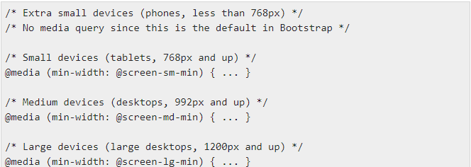
Media queries क्या होती है ?
Media queries भी एक तरह की conditional css होती है |
इन्हे एक specific screen size के लिए लिखा जाता है और जैसे ही कंडीशन फुलफिल होती है हमारी css स्टाइल अप्लाई हो जाती है |
Media query की मदद से आप अपने कंटेंट को स्क्रीन साइज के हिसाब से छिपा या दिखा सकते है |
कुछ Media query के एक्साम्प्ले निचे निम्नलिखित है |
कभी-कभी इनका विस्तार अधिकतम-चौड़ाई को शामिल करने के लिए किया जाता है|
ताकि CSS को उपकरणों के एक संकीर्ण सेट तक सीमित किया जा सके।
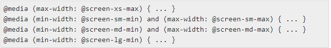
मीडिया प्रश्नों के दो भाग होते हैं, एक उपकरण विनिर्देश और फिर एक आकार नियम। उपरोक्त मामले में, निम्नलिखित नियम सेट है –
आइए इस line पर विचार करें…

सभी उपकरणों के लिए न्यूनतम-चौड़ाई के साथ कोई फर्क नहीं पड़ता: @ स्क्रीन-एसएम-मिनट यदि स्क्रीन की चौड़ाई @ स्क्रीन-एसएम-मैक्स से छोटी हो जाती है, तो कुछ करें।
Grid option :
यहाँ नीचे दी हुई टेबल में आप देख सकते है की आप किस तरह से Grid rows और column को सेट कर सकते है |

Basic Grid Structure :
नीचे आप bootstrap का basic grid structure देख सकते है |
<div class = "container">

   <div class = "row">
      <div class = "col-*-*"></div>
      <div class = "col-*-*"></div>
   </div>

   <div class = "row">...</div>

</div>

<div class = "container">
   ....
</div>
नीचे आप कुछ और ग्रिड example देख सकते है |
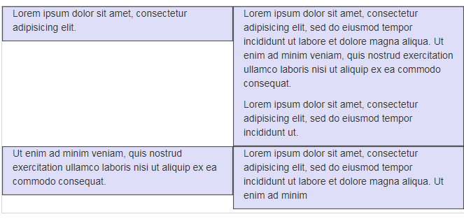
Responsive column resets:
ग्रिड के चार स्तरों के उपलब्ध होने के साथ, आप उन मुद्दों में भाग लेने के लिए बाध्य हैं|
जहां कुछ निश्चित विराम बिंदुओं पर, कॉलम बिल्कुल सही नहीं होते हैं क्योंकि एक दूसरे की तुलना में लंबा होता है।
इसे ठीक करने के लिए, क्लास .clearfix और रेस्पॉन्सिव यूटिलिटी क्लासेस के संयोजन का उपयोग करें जैसा कि निम्न उदाहरण में दिखाया गया है –
<div class = "container">
   <div class = "row" >

      <div class = "col-xs-6 col-sm-3" style = "background-color: #dedef8;
         box-shadow: inset 1px -1px 1px #444, inset -1px 1px 1px #444;">

         <p>Lorem ipsum dolor sit amet, consectetur adipisicing elit.</p>
      </div>

      <div class = "col-xs-6 col-sm-3" style = "background-color: #dedef8;
         box-shadow: inset 1px -1px 1px #444, inset -1px 1px 1px #444;">

         <p>Lorem ipsum dolor sit amet, consectetur adipisicing elit, sed do
            eiusmod tempor incididunt ut labore et dolore magna aliqua. Ut
            enim ad minim veniam, quis nostrud exercitation ullamco laboris
            nisi ut aliquip ex ea commodo consequat.</p>

         <p>Lorem ipsum dolor sit amet, consectetur adipisicing elit, sed do
            eiusmod tempor incididunt ut.</p>
      </div>

      <div class = "clearfix visible-xs"></div>

      <div class = "col-xs-6 col-sm-3" style = "background-color: #dedef8;
         box-shadow: inset 1px -1px 1px #444, inset -1px 1px 1px #444;">

         <p>Ut enim ad minim veniam, quis nostrud exercitation ullamco
            laboris nisi ut aliquip ex ea commodo consequat.</p>
      </div>

      <div class = "col-xs-6 col-sm-3" style = "background-color: #dedef8;
         box-shadow: inset 1px -1px 1px #444, inset -1px 1px 1px #444;">

         <p>Lorem ipsum dolor sit amet, consectetur adipisicing elit, sed do
            eiusmod tempor incididunt ut labore et dolore magna aliqua. Ut
            enim ad minim</p>
      </div>

   </div>
</div>
Output:
Offset Columns:
अधिक विशिष्ट लेआउट के लिए ऑफ़सेट एक उपयोगी विशेषता है।
उनका उपयोग अधिक रिक्ति के लिए स्तंभों को ऊपर धकेलने के लिए किया जा सकता है|
(उदाहरण के लिए)। .col-xs = * कक्षाएं ऑफ़सेट का समर्थन नहीं करती हैं, लेकिन उन्हें एक खाली सेल का उपयोग करके आसानी से दोहराया जाता है।
बड़े डिस्प्ले पर ऑफ़सेट का उपयोग करने के लिए, .col-md-offset-* क्लासेस का उपयोग करें।
ये वर्ग एक कॉलम के बाएँ हाशिये को * कॉलम से बढ़ाते हैं जहाँ * 1 से 11 तक होता है।
निम्नलिखित उदाहरण में, हमारे पास .. है, हम इसे class .col-md-offset-3 का उपयोग करके केन्द्रित करेंगे।
<div class = "container">

   <h1>Hello, world!</h1>

   <div class = "row" >
      <div class = "col-xs-6 col-md-offset-3" style = "background-color: #dedef8;
         box-shadow: inset 1px -1px 1px #444, inset -1px 1px 1px #444;">

         <p>Lorem ipsum dolor sit amet, consectetur adipisicing elit.</p>
      </div>

   </div>

</div>
Output:

Nesting columns:
अपनी सामग्री को डिफ़ॉल्ट ग्रिड के साथ नेस्ट करने के लिए, मौजूदा .col-md-* कॉलम में एक नई .row और .col-md-* कॉलम का सेट जोड़ें।
नेस्टेड पंक्तियों में स्तंभों का एक समूह शामिल होना चाहिए जो 12 तक जुड़ते हैं।
निम्नलिखित उदाहरण में, लेआउट में दो कॉलम हैं, दूसरे को दो पंक्तियों में चार बॉक्स में विभाजित किया गया है।
<div class = "container">
   <h1>Hello, world!</h1>

   <div class = "row">

      <div class = "col-md-3" style = "background-color: #dedef8;
         box-shadow: inset 1px -1px 1px #444, inset -1px 1px 1px #444;">

         <h4>First Column</h4>
         <p>Lorem ipsum dolor sit amet, consectetur adipisicing elit.</p>
      </div>

      <div class = "col-md-9" style = "background-color: #dedef8;
         box-shadow: inset 1px -1px 1px #444, inset -1px 1px 1px #444;">

         <h4>Second Column- Split into 4 boxes</h4>
         <div class = "row">

            <div class = "col-md-6" style = "background-color: #B18904;
               box-shadow: inset 1px -1px 1px #444, inset -1px 1px 1px #444;">

               <p>Consectetur art party Tonx culpa semiotics.
                  Pinterest assumenda minim organic quis.</p>
            </div>

            <div class = "col-md-6" style = "background-color: #B18904;
               box-shadow: inset 1px -1px 1px #444, inset -1px 1px 1px #444;">

               <p>sed do eiusmod tempor incididunt ut labore et dolore magna
                  aliqua. Ut enim ad minim veniam, quis nostrud exercitation
                  ullamco laboris nisi ut aliquip ex ea commodo consequat.</p>
            </div>

         </div>

         <div class = "row">

            <div class = "col-md-6" style = "background-color: #B18904;
               box-shadow: inset 1px -1px 1px #444, inset -1px 1px 1px #444;">

               <p>quis nostrud exercitation ullamco laboris nisi ut aliquip
                  ex ea commodo consequat.</p>
            </div>

            <div class = "col-md-6" style = "background-color: #B18904;
               box-shadow: inset 1px -1px 1px #444, inset -1px 1px 1px #444;">

               <p>Lorem ipsum dolor sit amet, consectetur adipisicing elit,
                  sed do eiusmod tempor incididunt ut labore et dolore magna
                  aliqua. Ut enim ad minim.</p>
            </div>

         </div>

      </div>

   </div>

</div>
Output:

Column Ordering:
बूटस्ट्रैप ग्रिड सिस्टम की एक और अच्छी विशेषता यह है कि आप कॉलम को एक क्रम में आसानी से लिख सकते हैं, और उन्हें दूसरे में दिखा सकते हैं।
आप .col-md-push-* और .col-md-pull-* संशोधक वर्गों के साथ अंतर्निर्मित ग्रिड कॉलम के क्रम को आसानी से बदल सकते हैं जहां * 1 से 11 तक होता है।
निम्नलिखित उदाहरण में हमारे पास दो कॉलम लेआउट हैं जिनमें बाएं कॉलम सबसे छोटा है और साइडबार के रूप में कार्य करता है।
हम .col-md-push-* और .col-md-pull-* कक्षाओं का उपयोग करके इन कॉलमों के क्रम को स्वैप करेंगे।
<div class = "container">
   <h1>Hello, world!</h1>

   <div class = "row">
      <p>Before Ordering</p>

      <div class = "col-md-4" style = "background-color: #dedef8;
         box-shadow: inset 1px -1px 1px #444, inset -1px 1px 1px #444;">

         I am on left
      </div>

      <div class = "col-md-8" style = "background-color: #dedef8;
         box-shadow: inset 1px -1px 1px #444, inset -1px 1px 1px #444;">

         I am on right
      </div>

   </div>

   <br>

   <div class = "row">
      <p>After Ordering</p>

      <div class = "col-md-4 col-md-push-8" style = "background-color: #dedef8;
         box-shadow: inset 1px -1px 1px #444, inset -1px 1px 1px #444;">

         I was on left
      </div>

      <div class = "col-md-8 col-md-pull-4" style = "background-color: #dedef8;
         box-shadow: inset 1px -1px 1px #444, inset -1px 1px 1px #444;">

         I was on right
      </div>

   </div>

</div>
Output:

You can also go through a few more extensive blog links related to Bootstrap:
Bootstrap Typography In Hindi…
Bootstrap CSS Overview In Hindi…
What Is Bootstrap Grid System In Hindi…
How To Setup Bootstrap In Hindi…
What Is Bootstrap In Hindi…
How to display bootstrap code in Hindi…
Quick Q&A:
What are the classes for grid system in Bootstrap? Bootstrap में grid system के लिए मुख्य classes कौन कौन सी होती है?
Bootstrap Grid system की मुख्य classes निम्नलिखित है:
xs (phones),
sm (tablets),
MD (desktops),
lg (larger desktops)
Output लेआउट को और dynamic और flexible बनाने के लिए आप इनमे से किसी भी class अथवा combination को use कर सकते है |
How many grid systems are there in Bootstrap? Bootstrap में कितने प्रकार के Grid system रहते है?
Grid को responsive बनाने के लिए पांच तरह के Grid break point होते है | यह ब्रेक पॉइंट्स निम्नलिखित है:
(extra small),
small,
medium,
large,
extra large
What are the 3 types of grid styles? दो प्रकार की Grid style कौन सी होती है?
तीन प्रकार के कॉमन Grid प्रकार होते है जिनको हम websites और interface में उपयोग करते है |
Column Grid
Modular Grid
Hierarchal Grid
इन सभी का interface में उपयोग बहुत ही common है |
Column Grid के अंतर्गत हम पेज को vertically divide करते है|
Conclusion:
तो दोस्तों इस ब्लॉग पोस्ट(What Is Bootstrap Grid System In Hindi) में हमने देखा कि grid क्या होती है और bootstrap grid system क्या होता है और किस तरह से हम bootstrap grid system का use करके अपनी website और web pages को responsive बना सकते है और वो भी बहुत कम समय में | bootstrap की मदद से हम HTML और CSS का use करके अपने web page को अपनी इच्छा अनुसार design करके उसे responsive बना सकते है और फिर वह वेब पेज चाहे किसी भी डिवाइस में ओपन को वो हमेशा अच्छी तरह से synschronise रहेगा और उसका content भी अच्छी तरह से show होगा और alignment में किसी भी तरह का disturbance नज़र नहीं आएगा |
इस ब्लॉग(What Is Bootstrap Grid System In Hindi) को लेकर आपके मन में कोई भी प्रश्न है तो आप हमें इस पते support@a5theory.comपर ईमेल लिख सकते है|
आशा करता हूँ, कि आपने इस पोस्ट(What Is Bootstrap Grid System In Hindi) को खूब एन्जॉय किया होगा|
आप स्वतंत्रता पूर्वक अपना बहुमूल्य फीडबैक और कमेंट यहाँ पर दे सकते है|What Is Bootstrap Grid System In Hindi|
आपका समय शुभ हो|